
Daley Designs Blog
An Account Of The Historic Home, The Clementine House in New Hampshire
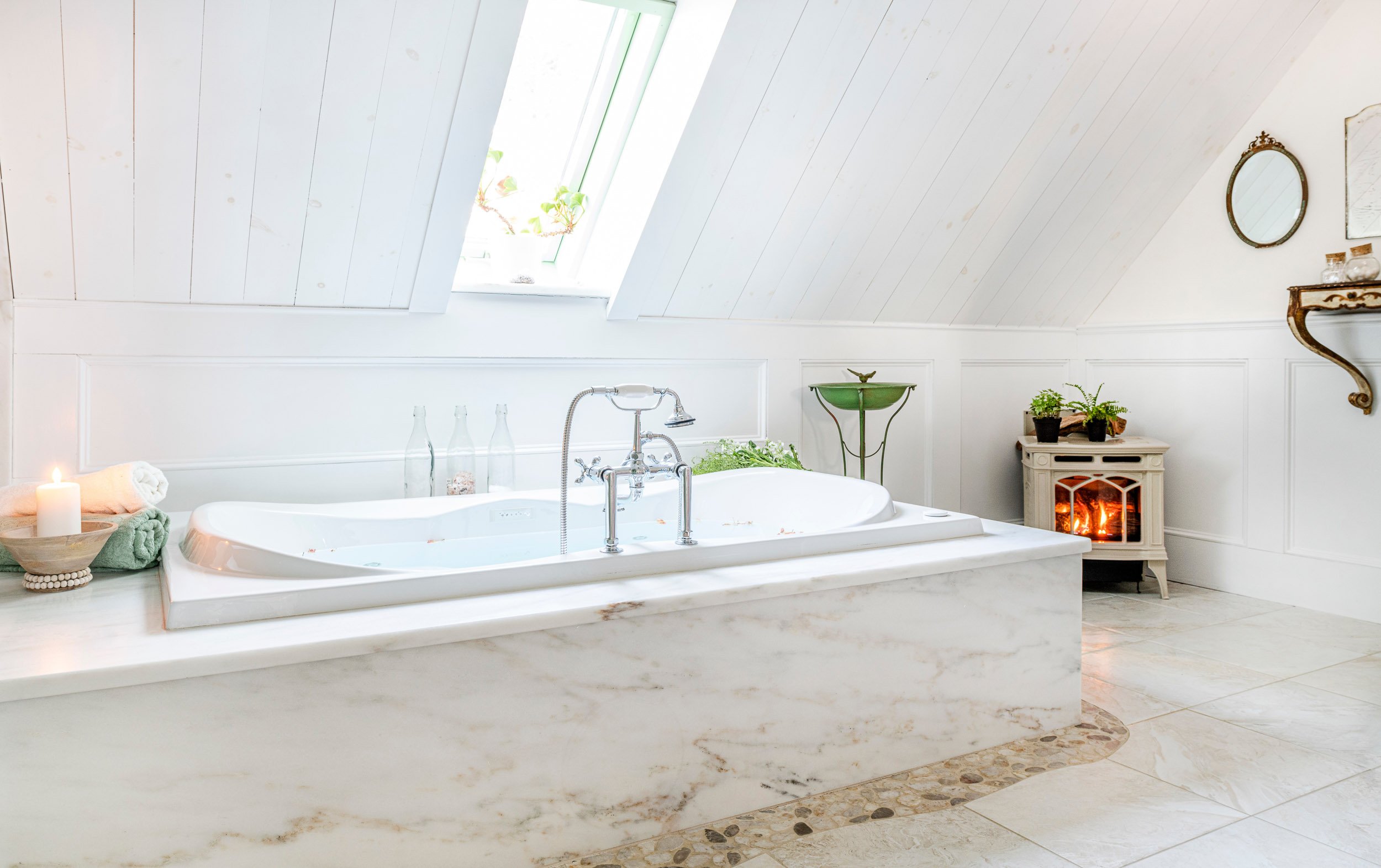
While renovating our historic home, the Clementine House in Sandwich, NH, we learned its history, about the man who built it and the families who loved it.

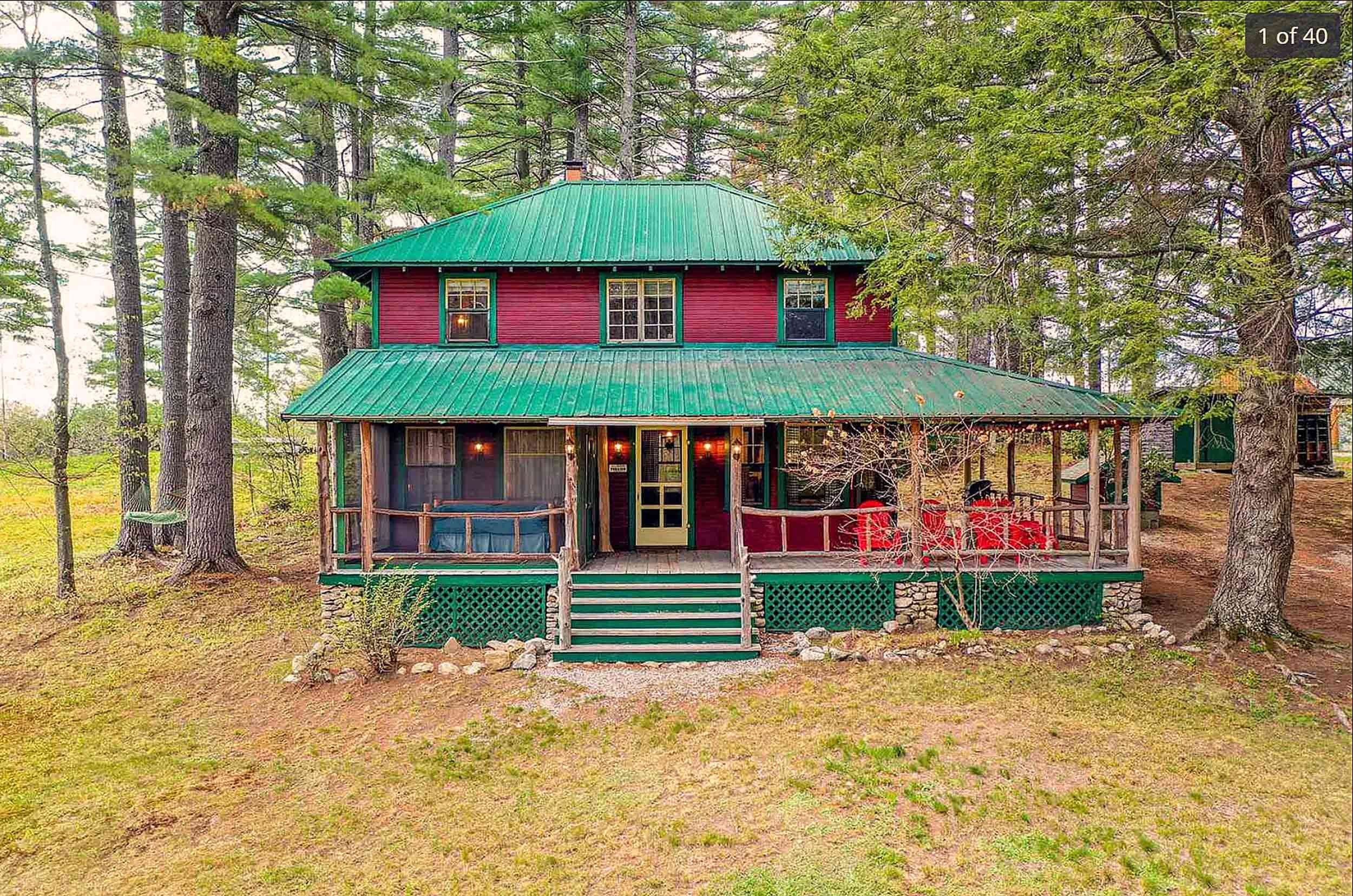
As a Luxury Experience Stay Property Clementine Stands Out
Learn from my experience finding a location, investing in, and creating a luxury experience stay property that was designed for high-wealth clients and ROI.

Debbe Daley Featured In Forbes Magazine, House Beautiful, and Time
Debbe Daley has been featured in Forbes Magazine. House Beautiful and Time Magazines Stamped. See what she has to say in these three national publications.

Creating a Home Office Space When Working From Home
A charming guest bedroom gets transformed into a home office with a murphy bed creating extra storage space and a more productive workspace.

Interior Motives Book Signing and Discussion at Circle Furniture
Watch my speaking engagement at the Circle Furniture showroom in Portsmouth, NH. I discuss my new book, Interior Motives Designing A Career With Passion.

Education Is Why Designers Attend The Luxury Home Design Summit
The Luxury Home Design Summit in Chatham, MA, an annual event for residential design professionals, is a highly respected affair for learning and networking.

What Is Quiet Luxury And Why It's Been Around For Years
Quiet luxury has been a style concept in interior design for years. It's related to but not the same as timeless design. Learn the details of quiet luxury.

Finding Your Perfect Paint Color At The Boston Design Center
Watch my Boston Design Center speaking engagement, Finding Your Perfect Paint Color, and learn where to begin when looking for a paint color for your home.

Finding An Interior Paint Color For Every Room In Your Home
All rooms should have a bit of the owner's personality in look and design. Here's how to select the perfect interior paint color for each room in your home.

What Does The Term Home Redesign Mean In Interior Design?
Home redesign or Interior styling are interior design terms that are shorthand for using the items currently available to create a fresh look. Learn More.

A Grateful Reflection on Six Years Cancer Free
Cancer Free: The untold story of not wanting to accept the news, the pink ladies club, and not slowing down and persevering until it was time to tell.
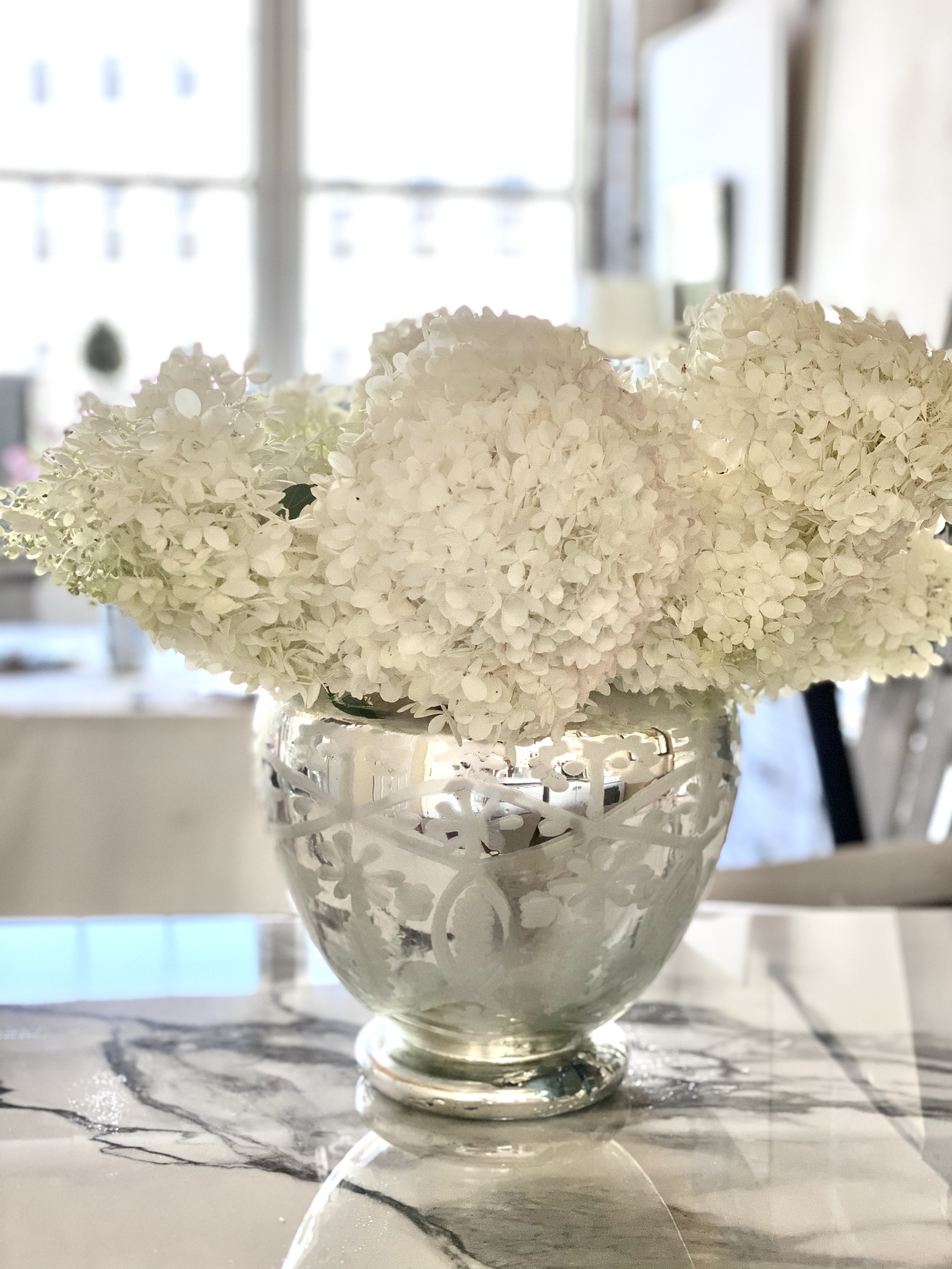
The Making of Hydrangea White by Debbe Daley
Are you looking for a creamy white paint color with a vintage hue? Check out my new Ethos Designer Signature paint color Hydrangea White by Debbe Daley.

Style Trends for the Home from High Point Furniture Market
The LA vibe, curves, orange colors, geometrics, stones, metals, and so much more were featured at the Fall High Point Furniture Market in North Carolina.

One Room Challenge Spring 2021 - Week 8
The final reveal of Creating a Keeping Room has been a mad rush for Week eight of the One Room Challenge. See more on what was done to complete the room.
One Room Challenge Spring 2021 Week 7 - Creating a Keeping Room
View the activity of Week 7 of ORC's Creating a Keeping Room. See what exciting progress has happened in a few short days after starting the final Week 8.